
Instant Eligibility Verification System (IEVS)
Make legacy tools feel intuitive again. Designing a product that feels effortless and works harder. I navigated a tangled, outdated system and turned it into a sleek, accessible, user-first interface. We didn't just redesign, we conducted a UI deep dive, aligned with backend logic, and created modular Figma components with accessible typography and bold CTAs.
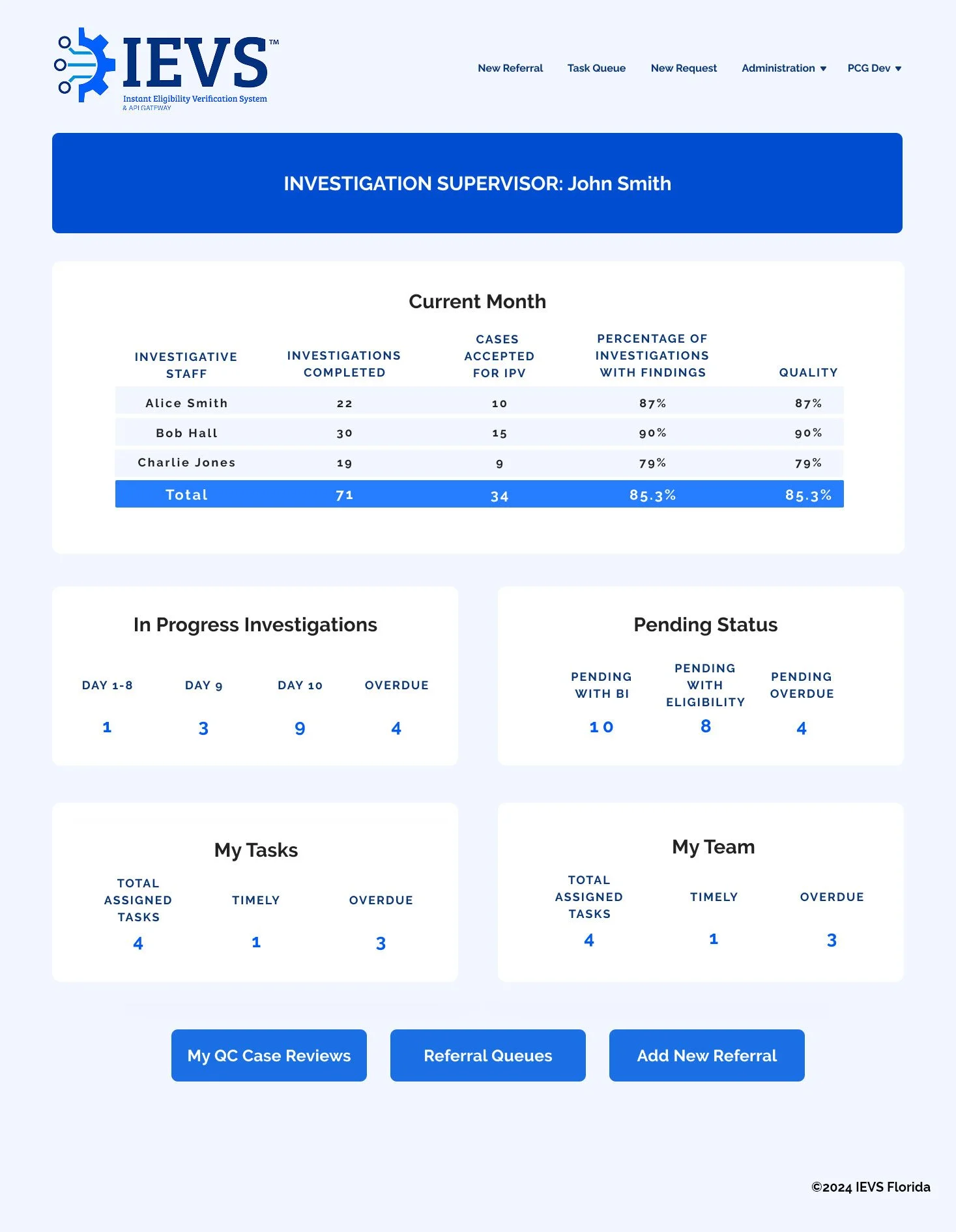
Problem Framing & Strategic Intent: The Income Eligibility & Verification System (IEVS) was burdened by an outdated, overly complex interface that made data entry cumbersome and error-prone, ultimately slowing down critical internal workflows. The system’s dense structure and lack of modern usability standards created friction for users and limited overall efficiency. The strategic intent was to transform this legacy tool into a streamlined, user-friendly platform that aligned with backend infrastructure while dramatically improving the front-end experience. By simplifying workflows, modernizing the UI, and applying accessible design principles, the goal was to enhance usability, reduce friction, and position the system as a more effective, intuitive tool for daily operations.
Challenge: Modernize a complex, legacy system without disrupting critical backend processes, while significantly improving usability for data-heavy workflows.
Strategic Aim: Design a streamlined, accessible UI that simplified data entry, enhanced user efficiency, and aligned seamlessly with existing backend infrastructure.

Old Logo
New Logo


Components

Input field options


Breakdown
To solve this, we began by conducting a thorough audit of the existing IEVS interface to identify pain points and inefficiencies in the user journey. Partnering closely with the data engineering team, we mapped out the system’s backend logic to ensure design alignment with technical constraints. I then led the redesign in Figma, creating a modular UI system that introduced modern design patterns, expanded input fields, accessible typography, and bold, intuitive CTAs. We prioritized clarity, hierarchy, and responsiveness, ensuring users could input and access data quickly and accurately. Throughout the process, we maintained a rapid feedback loop across teams, allowing for iterative improvements and a smooth transition to the new experience. The result was a significantly more efficient, user-centered system that improved accuracy, reduced cognitive load, and elevated the organization’s overall digital maturity.